I am doing AS photography. My current project is connected images. My initial idea was to create a flip book but that has now developed in to a stop frame animation of photographs I took in the photography studio.
My idea for heartbreaker came from the theme of love and was developed through word association from there.
Friday, January 21, 2011
Sophia-Art of Lost Words
For this project I have been asked to adopt an endangered word, which is in risk of ‘falling out of the English dictionary’ and promise to use it frequently. To adopt a word I had to visit the website http://www.savethewords.org/ and look through a list of diverse words. From this I can produce my own artwork which uses and incorporates the word which I chose, succeeding with the objectives of my project.
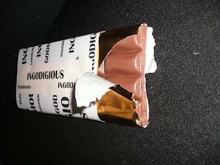 After researching and analyzing the 3 artists work I chose a word from http://www.savethewords.org/ to use to produce my own art involving the word. My word is ingordigious, which means greedy. I really liked this work as I could take my word in so many directions with greed being a part of so many factors in life, such as, food, gambling, money etc. I then produced some origami shapes based on my word and photographed them. My favourite origami shape and photograph is this. It’s my favourite because I really like the camera angle and how I have used actual sweet wrappers and put them in the image to. Also, I like how you can slightly see down the tube and how the sweets are resting on each other.
 I disliked this origami shape and photograph because it doesn’t look like what it is meant to be. The idea behind this origami shape was how vines on a tree are greedy for sunlight and ‘strangle’ the tree to get to it. However, I think it looks more like an arrow, and the photograph is to close up.

After photographing all of my origami I edited a selection of photographs which I had taken. I edited two for each shape I did. My favourite edited photo is this because I really like the effect which was put onto it. I liked the photograph before it was edited but with the contrasted turned up on the effect I think it makes it look more professional and interesting. I think it creates a better atmosphere and adds more depth to the photo. As my word has a strong, bold meaning, I wanted to make my work stand out and show the statement of the word. I feel like I have achieved this, making it much easier to move on to the next stage of my development.
 If I am to edit the photographs which I have taken in the future I will take into account the improvements needed for some of these photographs. Overall, I have enjoyed doing taking the photographs and editing them in Photoshop and I would like to carry this on further throughout my work. However, I would like to make it more detailed and have an improved, professional quality to the finish.


Friday, January 7, 2011
Btec Subsidiary Diploma Graphic Design- Nshape
Students were asked to create a design for a new "N-Shape" phone using Abobe Photoshop and Illustrator. They had to produce all elements of the images themselves from the photos to the brushes they used.


Grant: This is a design that I came up with for the N Shape. I made the guitar on adobe illustrator but going around a picture using a pen tool and adding certain detail to it. I tried to achieve an image that advertises the phone within the catergory music.

Vishal: The design itself heavily relates to an exisiting advertisement by Samsung, which examines how sound waves are interpreted, here through the use of large circles.


Ryan: This is my attempt at advertising The 'N-shape' phone I was aiming for an elcetronic futuristic feel.

Subscribe to:
Posts (Atom)