Showing posts with label A2. Show all posts

Thursday, June 9, 2011

Libby- A2 Art:Attention to Detail

For my A2 project I chose to investigate “attention to detail.”

As it was my last unit I wanted to create a very powerful and meaningful piece of art. I chose to explore disability and how it is portrayed, this is a very personal subject to me as I was diagnosed with multiple sclerosis (MS) when I was sixteen. MS affects me differently day to day; some days I appear perfectly able bodied where as others days I need to use a wheel chair. So I see and experience the way the world treats you when you are perceived as having a disability. I have lived with MS for almost four years and now felt like I was strong enough to voice my opinions through my 3D artwork. I first looked in to the art of collage as this helped me to create a very personal unseen message which then would run through to further my development.


There are two meanings behind this collage; the first a disabled person looking up at god and asking why them, or god looking down and choosing who is strong enough to cope with a disability.

I now wanted to turn my attention to 3D collage, with the idea that man and machine as one. I made a series of with this theme trying to make the part of the chair and the human figure ambiguous. On all pieces I wanted the wheels to stand out as they tend to be the first thing people see. This tends to trigger one of the following responses, people either completely ignore you or they treat you like you are stupid.

The idea behind the art is that most people will see the wheel chair first and not the person, which is why I used a blank white body to symbolise the ignorance that some people show towards disability. Throughout these past four years I have been in a wheel chair, used crutches, walking sticks a number of things to help me cope but when I have good days when I don’t need any I have been discriminated just because my disability isn’t visible. What most people don’t take into account is the mental side and trust me I have been pushed to my limits, although I have not accepted my illness yet, I can already see that it has made me a better person and I want all viewers to take away my story and hopefully see that world differently without having to go through what I have.

Tuesday, February 8, 2011

Amy-A2 Product Design

For my A2 Product Design project I chose something a bit different to the usual architecture projects and decided to go for a textiles project. I was inspired by a local cheerleading squad, Momentum Surge, to design a training gear for their weekly practices. They already have a uniform worn for competition and performances, but the uniforms are very expensive so they need something to wear for practice which makes them feel like a squad. The training uniform should coincide with the competition uniform, by featuring similar colours and styles. Below is a photograph of one of the squads’ uniforms, and an example of why the training gear needs to allow for a full range of movement.


I am still working on a range of different designs and am in regular communication with the client to get feedback on what they like. I have also done some card models to feature the clothes on to gain a better idea of what the garments would look like on the figure of a person.


I’m also working on designing a logo to feature on the gear, so that it is identifiable to the squad. I’ve been using Adobe Illustrator to do this, and have come up with a variety of designs which I will pitch to the client to get feedback on which one they most like. 


Friday, January 21, 2011

Sophia-Art of Lost Words

For this project I have been asked to adopt an endangered word, which is in risk of ‘falling out of the English dictionary’ and promise to use it frequently. To adopt a word I had to visit the website http://www.savethewords.org/ and look through a list of diverse words. From this I can produce my own artwork which uses and incorporates the word which I chose, succeeding with the objectives of my project.
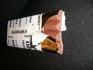
After researching and analyzing the 3 artists work I chose a word from http://www.savethewords.org/ to use to produce my own art involving the word. My word is ingordigious, which means greedy. I really liked this work as I could take my word in so many directions with greed being a part of so many factors in life, such as, food, gambling, money etc. I then produced some origami shapes based on my word and photographed them. My favourite origami shape and photograph is this. It’s my favourite because I really like the camera angle and how I have used actual sweet wrappers and put them in the image to. Also, I like how you can slightly see down the tube and how the sweets are resting on each other.
I disliked this origami shape and photograph because it doesn’t look like what it is meant to be. The idea behind this origami shape was how vines on a tree are greedy for sunlight and ‘strangle’ the tree to get to it. However, I think it looks more like an arrow, and the photograph is to close up.

After photographing all of my origami I edited a selection of photographs which I had taken. I edited two for each shape I did. My favourite edited photo is this because I really like the effect which was put onto it. I liked the photograph before it was edited but with the contrasted turned up on the effect I think it makes it look more professional and interesting. I think it creates a better atmosphere and adds more depth to the photo. As my word has a strong, bold meaning, I wanted to make my work stand out and show the statement of the word. I feel like I have achieved this, making it much easier to move on to the next stage of my development.
If I am to edit the photographs which I have taken in the future I will take into account the improvements needed for some of these photographs. Overall, I have enjoyed doing taking the photographs and editing them in Photoshop and I would like to carry this on further throughout my work. However, I would like to make it more detailed and have an improved, professional quality to the finish.

Thursday, December 16, 2010

Carl-A2 Art and Design

As an A2 art student at Stoke-on-Trent Sixth Form College I am currently working on a project, ‘Art of the Lost Words’ , a project aimed at reintroducing words that are either no longer used at all in modern language, or are slowly in decline. The overall aim of the project is to prevent these words from being lost altogether and to bring them back into common use through the medium of art. The word I chose was ‘Scathefire’, meaning very destructive fire, part of the project brief involved creating origami models relating to the chosen word. I elected to make paper trees for my origami and made a large number in order to compose a ‘tree forest’. After photographing them together I decided to reintroducing my word back into my work, by setting fire to, and burning my trees, creating an imitation of my version of a ‘forest fire’.

In order to try and bring back my chosen word another element of the project requires a ‘Graphic Product’ to be made using images and photos from earlier in the project in order to carry on the theme and make it flow.  The function of the graphic product is to spread the use of the word by mass distribution. In order to do this I decided upon a CD album cover, bearing the band name ‘The Scathefire’, using an image from my burning trees I ‘photo shopped’ it to make it more exciting and bold.  Incorporating a lighting strike as is the cause of many forest fires.

On completion of my graphic product I then resolved to explore the theme of ‘environment’ and issues that surround this topic; using work that I had previously studied gave me inspiration for this area.  After looking at work by ‘Andrew Tift’ a painting of a car factory onto a body panel, my first step in the direction of environment was to source a car body panel that was to be scrapped. I then proceeded to paint an image that would be the opposite of the damage that cars inflict upon the environment; the object I chose to signify this was a tree.

  I also decided to have an attempt at pencil carving with inspiration from an artist previously looked at with the theme of environmental art.  Dalton Ghetti creates highly intricate sculpture out of nothing more than an old pencil, shaping the lead into amazing shapes and objects.  In my attempts I copied his idea of the alphabet and after many trials with broken lead I finished with the letter ‘L’ and the Letter ‘F’.
After this was done I decided to reverse the roles of my work, instead of painting an image of a tree on a car, I painted a car onto a piece of wood.  I wanted to create a highly realistic and detailed image that could almost be lifelike.  First I had to scout out a vehicle that has a distinguished shape that is common and instantly recognisable as ideally this piece should be viewed from a distance and therefore the shape and lines are important. It would also be imperative to get the shape and shading of the vehicle correct or the whole piece would look wrong.  After looking around a local car park I settled upon a ‘Peugeot 206’ for its significant shape and front grille section.


After doing both of these pieces I realised that I had theme running through my work, painting on things that are not necessarily painted on. I therefore went about looking for things that are not normally considered as canvases, the next item I decided upon was a television which I am currently working on painting a scene that includes a tree.


Monday, December 13, 2010

Tuesday, December 7, 2010

Ryan-A2 Product Design

My name is Ryan, I am currently studying graphic design and product design at Stoke Sixth Form College. This is a small insight into my product design course, which is to design and develop a vehicle that can be used by the emergency services that will be a hybrid as so to speak that will be a link between the first responders and the fire and rescue service. I have focused my concept vehicle towards the road traffic incident area, as this type of emergency requires fire and rescue as well as paramedics and the fire service.

The vehicle is based loosely on Landover’s new city style 4x4. The following are just some ideas I had generated to be accessories, solutions or general design inspiration.

Here I am throwing some ides around about sirens and lighting ideas, loosely rendered in marker.

In this sheet of ideas I am generally just putting ideas together, but on this sheet I talked about the ground clearance angles of hills and where the vehicle would bottom out.

This is hopefully what the vehicle will look like at the end of my project.

Wednesday, December 1, 2010

Vishal- A2 Art 'Update'

After finally getting my infographics work completed for my graphic product I have started to explore a more diverse side of my creativity. The focus is now on relating my work to Shepherd Fairey as well as translating it through a message which relates to the theme of Snollygoster.

One interesting graphic that I came across during the Election earlier this year has started to shape the recent progress I have made within this project.
http://news.bbc.co.uk/1/shared/election2010/results - this is the link that I found which depicts a proportional measure of seats won by each party in the 2010 General Election. I noted that the pattern and style that this graphic has been created through is one that I could utilise for my independent development, therefore I began to produce an array of patterns using stencils to experiment with composition, scale, proportion and style.

The results were terrific and I decided to relay the pattern from the infographic onto these stencils by using Photoshop – further layering it within the vectorised image of Gordon Brown seen within my previous post, as well as “despeckled” images of the Labour rose. All of this led to the below outcome of a party political poster that takes advantage of all of my research upto this point.


In relation to Shepherd Fairey I feel the piece has strong visual links with the way in which Fairey uses “worn” images and stencilling, however to kindly humiliate my own support for left wing politics I have also created the below piece which heavily relates the Fairey-esque style of stand up politics; labelled as “The Social State” it relates to the surveillance and interference of our previous government within society, exposing the disparity between our fair democracy and other more extreme left wing socialist dictatorships. It is this piece that brings me to the end of Task 11 and onto my independent development – therefore I wish for my work to evolve into something much darker, and maybe much more cynical.

The next stage of this project is now to explore the reverse side of left wing politics; Conservatism. More so by exploring the role of religion and society within a conservatively dictated nation, namely the Southern States of the US, as well as our own current “Conservative” arrangement.

Monday, November 29, 2010

Abbey-A2 Art and Design

For my A2 Art this year I have been working on a project called The Art of Lost Words. I chose the word Perantique which means old and ancient. I started by experimenting with typography developing a pattern out of different fonts and sizes. I then folded my typography into an origami owls which I felt represented old and ancient.
I then experimented with collage and image montage (graphic product). I began to focus on jewellery made out of the images and old images I created.
I liked these jewellery pieces I made, however I wanted to create something more substantial and experiment with wood, metals and plastics more.

I started by heat pressing some of my image montages onto ply wood. Then I drew the shape of my owls onto 2D design ready to lazer cut them out of my ply wood. I experimented putting these together in different ways with different findings and small screws.

I am starting to experiment more with jewellery and creating different styles of brooches looking at traditional jewellery for inspiration. These are some of my designs I have come
up with.

I have experimented with different types of acrylic to produce my designs.


What I love about my project so far is my wooden owl necklace. I feel it has worked better than my other necklaces/bracelets as it has the traditional look, which I wanted to achieve with my word meaning old and ancient. I am now developing new angular designs inspired by my origami shape.

Wednesday, November 10, 2010

Vishal-A2 Art and Design

The project brief for art this year was titled as “The Art of Lost Words”; to pick a word that is in danger of becoming unused from Save the Words and to bring it back into the vocabulary through means of products, posters and individual artworks. I chose the word Snollygoster (a shrewd, unprincipled person – especially a politician) from a frantic array of lost phrases that yelp every time you hover over them, who would have thought such an historical expression of significance would be hidden beneath such vulgarism? Anyway, I am glad that I found this word as I am confident that I can reintroduce it back into the vocabulary at least within petty advertisements or slogans for political parties, a technique that I have found interesting undertaking within my sketchbook.
As well as this, I have tried to relate the word to Bush-era politics which define, in my opinion, the true connotation of the word Snollygoster. I have explored this through the use of info-graphics, which presents information that I have collected online regarding the recent political history of Britain, Europe and America through means of Military Expenditure rises, popularity of administrations and the usual jargon that follows political debates. 

My latest endeavour was to create an “individualised” artwork; however I chose to take inspiration from Shepherd Fairey’s truly amazing work on political sentiments – using powerful illustration and subversions to publicise one’s opinions (a characteristic I would like to apply to the word Snollygoster). Throughout this I will be experimenting with different patterns, portraits, quotations and stencils to create work that has relevancy to my project, as well as the personality of Shepherd Fairey. I have alot more to do throughout this project and for the year; in terms of research, development and maturing my own creativity, yet so far I have enjoyed finding myself through this very interesting project brief.

Sunday, November 7, 2010

Howard- A2 Photography


During my current studies in Photography A2 I am looking at the combination of two themes inside and outside. I recently responded to a piece of work by Valerie Belin by going up to the Roaches. I decided to bring some objects we associate with the inside and put them in the outside environment. The Roaches was a good place to take pictures because it gave me an interesting outside environment in which to work in. I also got to go climbing which was a fun bonus. I am now looking at how I can follow on from this idea to develop it into a commercial product.
 

Harriet- A2 Art and Design

This year as part of my A2 Art and Design I have already begun a series of exciting new projects. The whole group are now working as a more experienced and confident art students, everyone is starting to set up a series of new pieces of art.

The project I am working on is called the art of lost words and the word I am work with is ‘Nubivagant’ it means; passing through the clouds. I chose this word from Save the Words to be the basis for this unit of work.

Wanting to commence the year with something that was going to inspire my work, and myself. I decided to create a large model using my preliminary images and origami work. Constructing a piece based on ‘moving among clouds’, with 200 origami peace cranes, I went on to produce a flock of birds. Here you can see I have photographed the model with dramatic lighting. I intended to create something unusual and eye-catching, in which people are attracted to its curious shape and odd presentation.

Using this as a foundation, following the brief I went on to create a graphic product and a mixed media piece. To carry through a geometric theme into my graphic poster I used silhouettes and sections from other images. Including vivid shades of blue to create a modern and eye-catching image.
I created a painting for the mixed media piece, right. Using pixilation I transformed an image of the model, creating a really unusual effect. I then painting this is onto a large board, I believe the clouds worked really well. This is the start of my project, and I am now moving onto creating geometric sculptures.